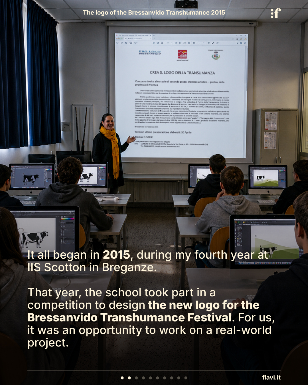
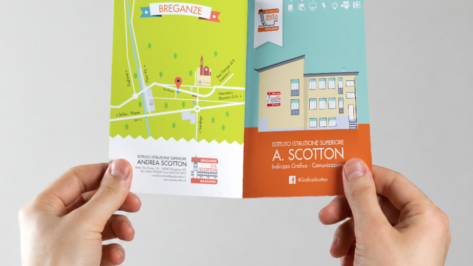
In 2015, while I was in my fourth year at IIS Scotton in Breganze, the school decided to take part in a competition organized by the Municipality of Bressanvido, the local Pro Loco, and Latterie Vicentine to design the new logo for the Bressanvido Transhumance Festival.
At the time, it was one of the first projects I had the opportunity to develop for a real client. It wasn’t just a school exercise—there was a clear objective, a place to represent, and an event that was entering an important new chapter in its history.
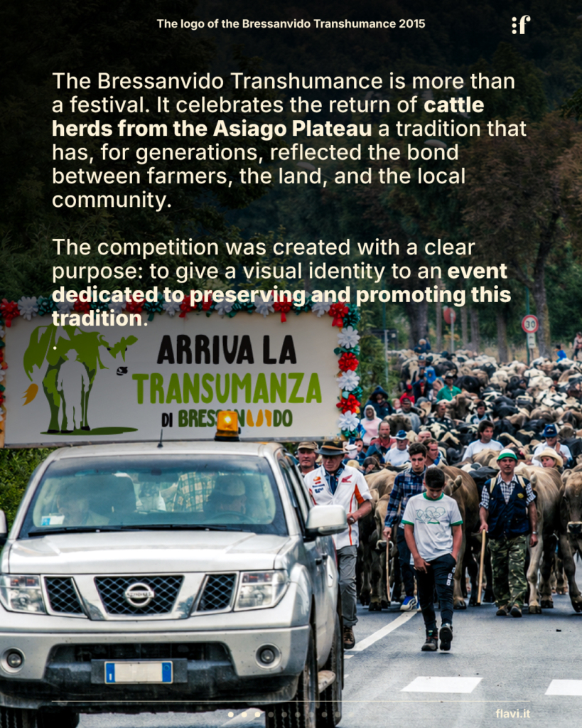
What we now know as the Bressanvido Transhumance Festival was growing. Alongside the traditional celebration, the first Agriculture Festival was being introduced to promote the local area, support regional products, and preserve a centuries-old tradition that risked disappearing. The new logo would accompany this evolution and become the symbol of the event.
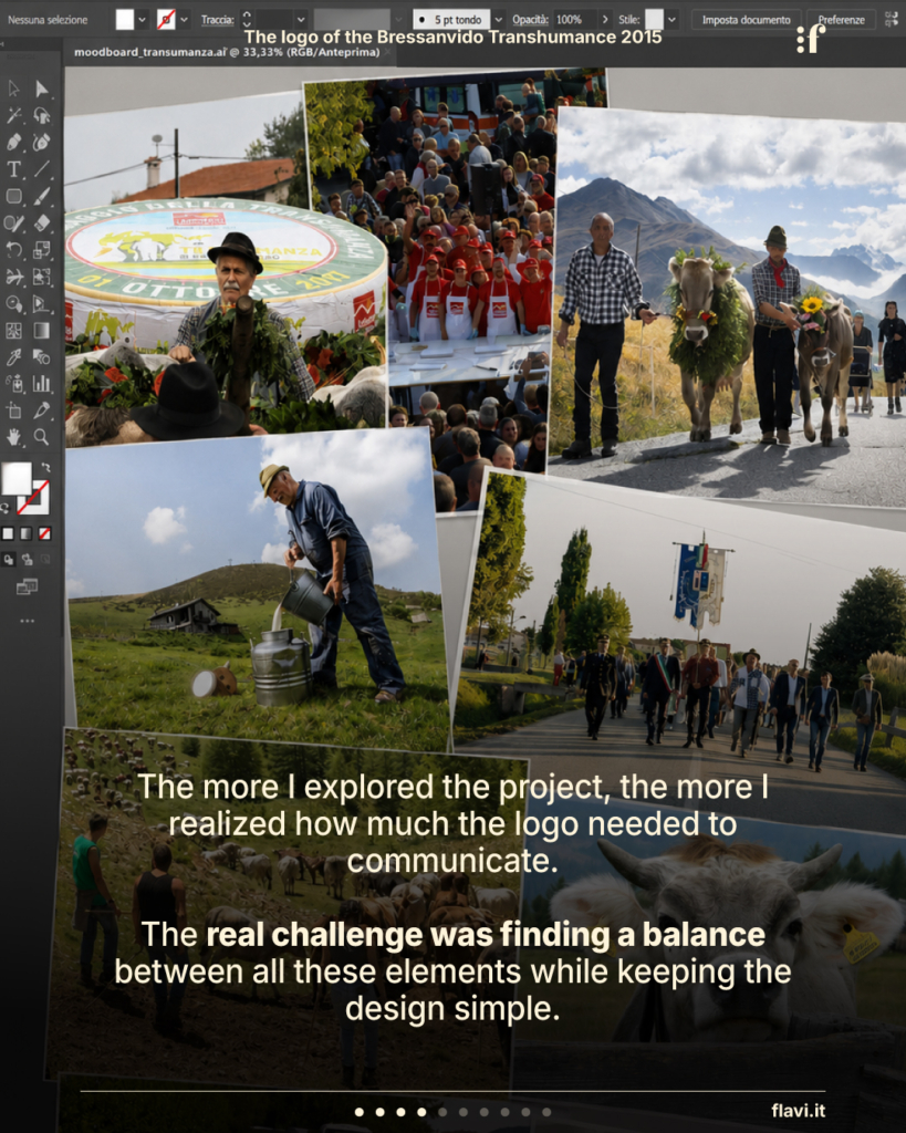
Before drawing anything, we spent time understanding what transhumance truly represented. In class, we studied the brief, collected visual references, discussed the role of farmers, and explored the connection between the mountains and the plains. The more I researched the project, the more I realized how much that logo needed to communicate.
The challenge wasn’t simply to create something visually appealing—it was to find a balance between all these elements while keeping the design simple. I wanted to create a symbol that would be immediately recognizable while also offering a deeper layer of meaning.
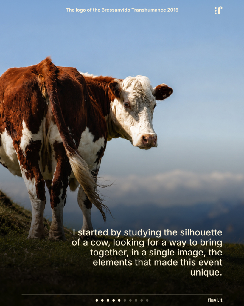
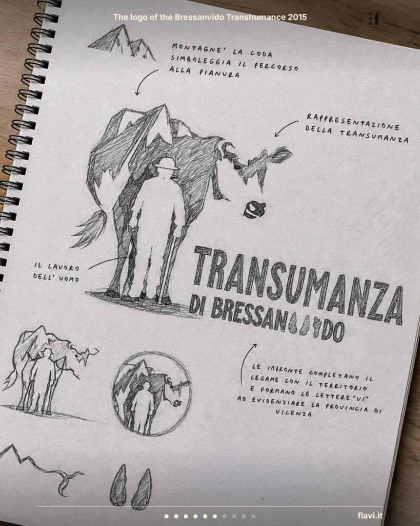
The idea emerged while studying the silhouette of a cow. It felt like the perfect shape to contain the entire story of the transhumance. Within that silhouette, I integrated the outline of the mountains, the figure of the farmer, the route leading from the plateau to the plains, and, within the lettering, footprints symbolizing both the movement of the herds and their connection to the Vicenza countryside. Every element had a purpose and contributed to telling a single, coherent story.
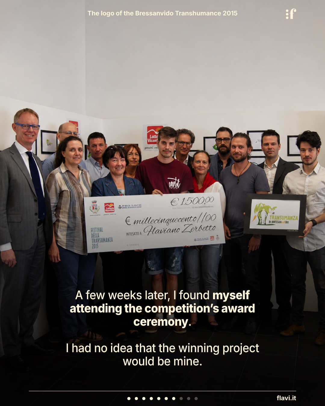
After submitting the project, several weeks passed. My teacher simply asked me to attend the award ceremony organized by Latterie Vicentine, without telling me anything else.
It was only that day that I discovered my design had been selected as the winner.
I still remember the excitement of that morning. Beyond the satisfaction of seeing my work recognized, I received a €1,500 prize—an amount that felt enormous for a student. Yet what has stayed with me most isn’t the prize itself. It’s the feeling of seeing, for the first time, one of my projects leave the classroom and become something real.
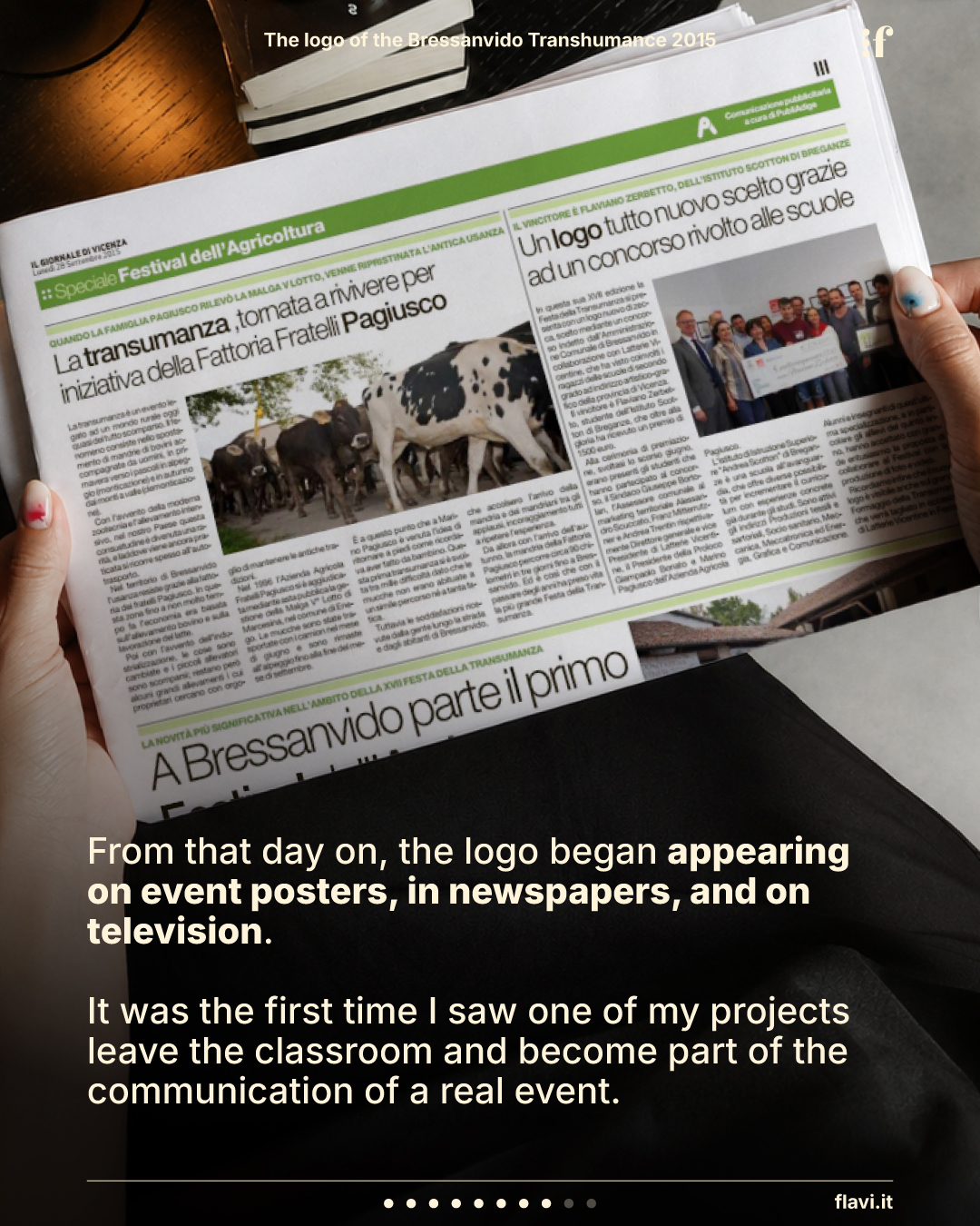
Over the following days, the logo began appearing in newspapers, television reports, and across the event’s communication materials. The jury praised both its visual impact and the richness of its symbolism, highlighting its ability to combine the farmer, the cow, and the mountains into a single image. Reading those words was difficult to describe. Only a few weeks earlier, the project had simply been a sketch on my school desk.
What I couldn’t have imagined was that the story wouldn’t end with the award ceremony.
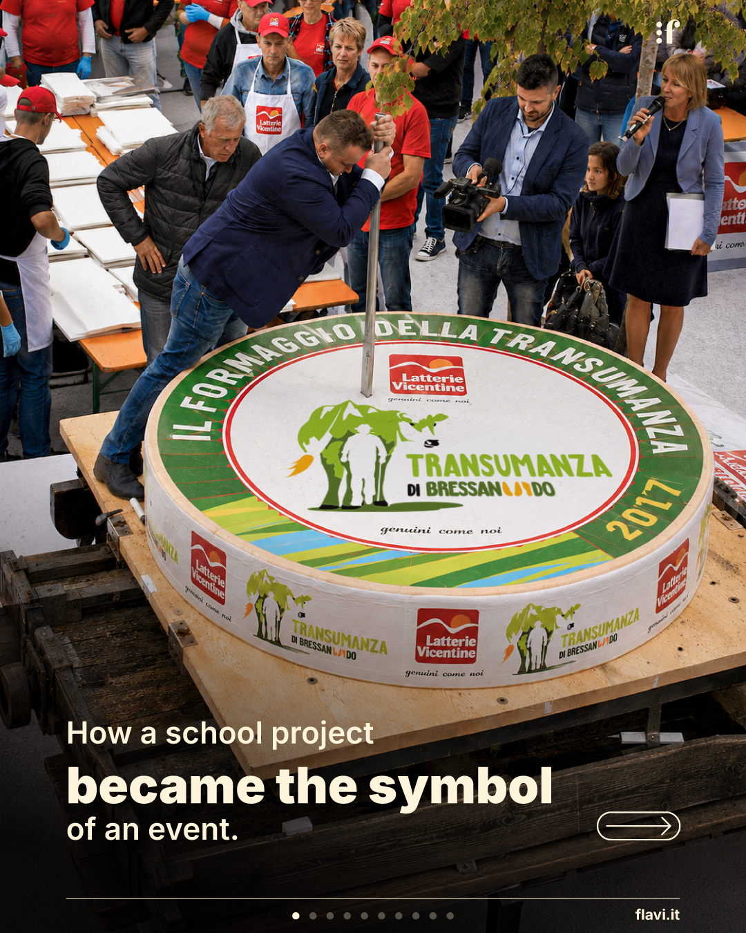
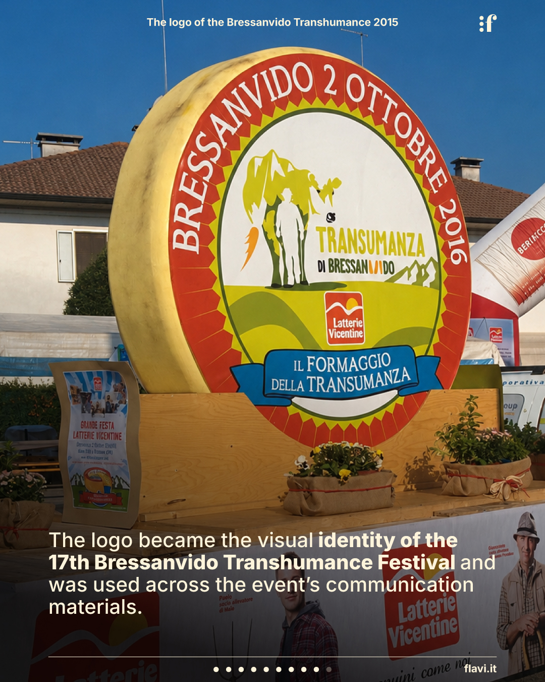
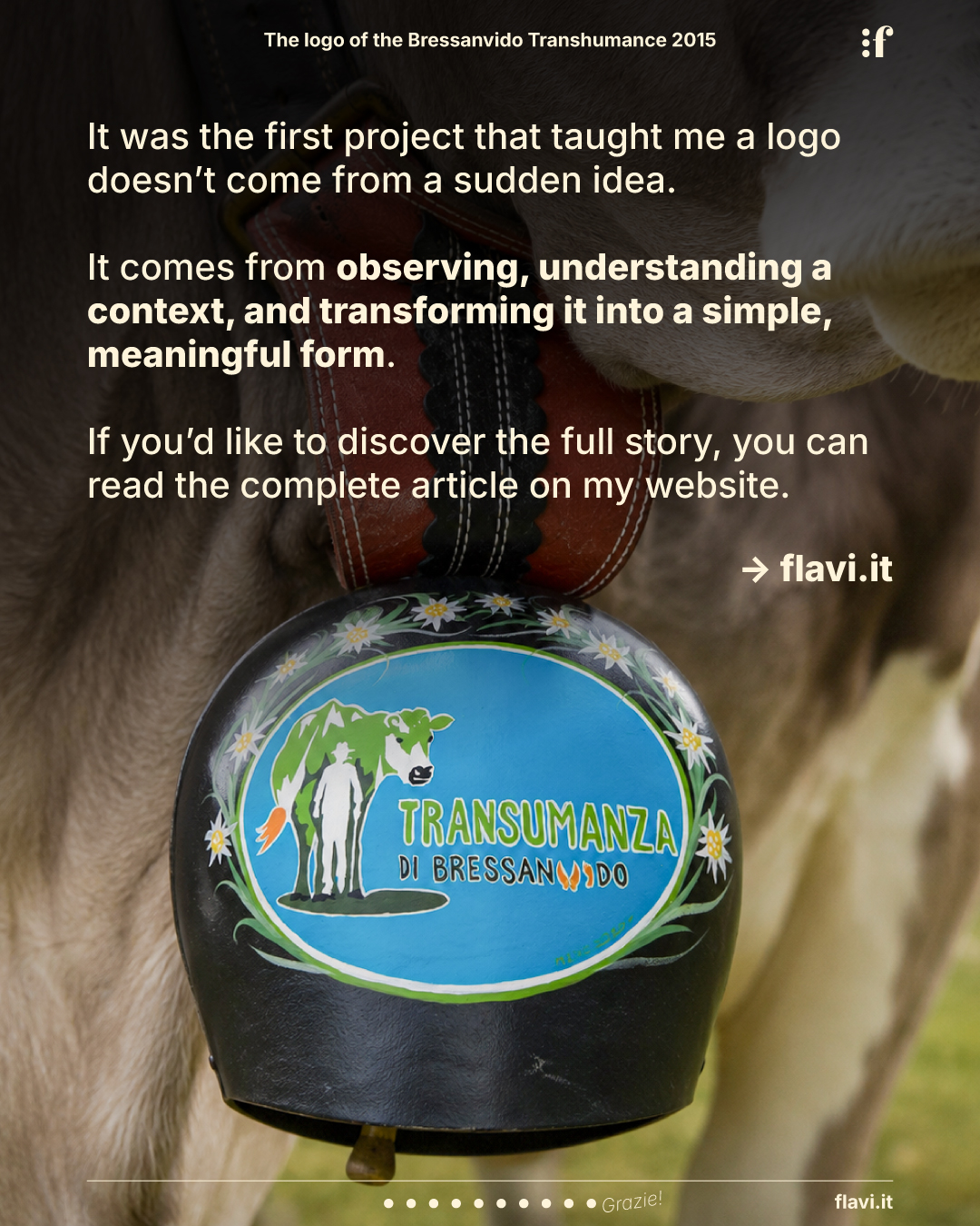
The logo began appearing on specially produced cheese wheels for the event, on the festival signage, across promotional materials, and even on the decorated cowbells created for the celebration. In the years that followed, it continued to accompany the festival’s communication, becoming its enduring visual identity.
Ten years later, I look at that logo with different eyes. There are details I would probably approach differently today, but what I wouldn’t change is the process that brought it to life.
It was the first project that taught me design doesn’t begin with software—it begins with observation. First you understand the context, then you connect ideas, and only at the end do you try to transform them into a simple, meaningful form.
Looking back today, I believe that was the most valuable lesson I took away from that competition.
And, in many ways, it’s still the same approach I bring to every new project.