

Graphic Design Trends 2026: What I Think Is Happening
Every year, around this time, the “Graphic Design Trends 2026” articles start popping up. Curated lists, buzzwords, visual styles that are supposed to define the next twelve months.
I’ve never completely understood the idea that design changes according to the calendar. It’s not spring/summer fashion. We don’t wake up in January and collectively decide that, from today onward, everyone should use tactile gradients or glass-like interfaces.
Design changes when something stops being enough.
And over the past few years, if I’m honest, we’ve reached a point of saturation. Minimalism everywhere. Spacious, flawless, quiet layouts. Ultra-polished 3D. Thoughtful, well-behaved interfaces that all feel… very similar.
It worked. It still works. But after a while, it stops being surprising—and more importantly, it stops saying anything.
What I see in graphic design for 2026 isn’t a revolution. It’s more of an adjustment. Like walking into a room that’s too white: you don’t renovate everything, you simply move a few things around, warm up the atmosphere, and bring a little more texture into the space.
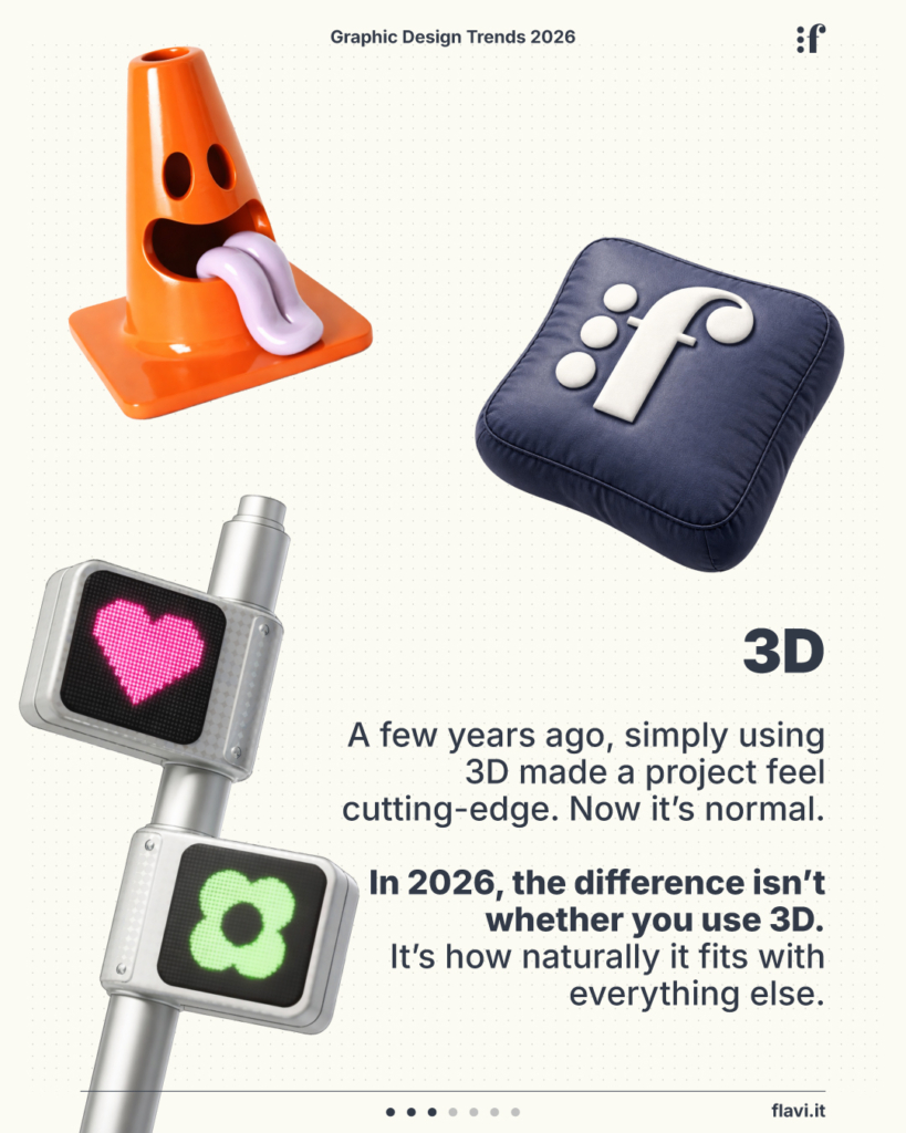
3D Is No Longer the Main Attraction
There was a time when placing a beautifully rendered 3D object on a clean background was enough to make a project feel modern.
Then the tools became easier to use. AI started generating complex scenes in seconds. And suddenly, 3D became normal. Just another visual language.
In web design for 2026, 3D isn’t disappearing—but it’s no longer the headline.
What matters is how it’s integrated. Does it genuinely belong to the project, or does it feel like something dropped in just to impress?
It’s similar to what happened with micro-interactions. At first they captured everyone’s attention. Eventually they became background noise.
Today, 3D works best when it doesn’t ask for applause—when it supports the system instead of shouting over it.
Buttons Are Becoming Buttons Again
Over the last few years, we’ve stripped away a lot.
Maybe too much.
Interfaces became cleaner and lighter.
Links started looking like ordinary text.
Buttons blended into the layout.
Elegant? Absolutely.
Clear? Not always.
What we’re seeing now isn’t a nostalgic return to leather textures or exaggerated shadows. It’s something much simpler: giving interactive elements enough physical presence to make them recognizable again.
A button that stands out.
A shadow that helps users understand where they can click instead of simply decorating the interface.
Feedback that removes uncertainty.
This isn’t about retro aesthetics.
It’s about respecting the people using the interface.
Gradients Aren’t Coming Back—They’re Evolving
Whenever people talk about graphic design trends for 2026, gradients are often presented as if they were making a comeback.
The truth is, they never disappeared.
They simply became too perfect.
Too smooth.
Too digital.
Too flawless.
Now we’re seeing gradients with more texture. A touch of grain. Softer, less clinical color transitions.
It’s a subtle difference, but it completely changes the feeling.
A perfectly smooth gradient feels computer-generated.
One with a slight texture feels almost like a physical surface.
Maybe it’s a reaction to years of extreme visual cleanliness.
Or maybe it’s simply a way to make digital design breathe a little more.
The Return of Desktop-Inspired Interfaces
Then there’s the resurgence of overlapping windows, visible cursors, chunky scrollbars, and interface elements inspired by older operating systems.
It’s happening especially within creative projects.
I’m not convinced it’s just nostalgia.
It feels more like an attempt to break away from perfectly centered, perfectly aligned layouts.
When everything becomes too orderly, introducing a little friction can make things feel alive again.
Of course, this isn’t a universal solution.
I don’t expect banks or highly institutional brands to fully embrace this language.
But in the right context, it works precisely because it disrupts that overly polished balance.
Digital Glass—Without the Toy-Like Feel
Liquid glass—or glassmorphism—isn’t new in digital design.
What’s changing is how it’s being used.
In the past, it often relied on obvious visual effects: transparency, blur, a little glow, and that was enough.
Now, when it’s done well, it feels more like a material than a filter.
Layers have a purpose.
Transparency doesn’t compromise readability.
Depth adds meaning instead of decoration.
This isn’t a new trend.
It’s a refinement.
Almost as if digital design is trying to recover a sense of dimensionality without becoming visually heavy again.
And Then There’s Something Less Visible
There’s another shift that rarely appears in trend reports, but I think it’s the most interesting one.
The more AI generates perfectly polished images, the easier it becomes to notice when something feels too perfect.
Everything aligned.
Everything clean.
Everything immaculate.
That’s why we’re starting to see small imperfections return.
Layouts that aren’t perfectly symmetrical.
Illustrations that aren’t excessively polished.
Compositions that don’t feel like they came straight from a template.
This isn’t a rejection of technology.
It’s a search for authenticity.
It’s like walking into a house that’s so perfectly tidy it almost feels like a showroom.
Then you notice a book left open on the table—and suddenly the whole place feels lived in.
When I look at graphic design in 2026, I don’t see one dominant style emerging.
I see designers trying to bring a little more substance back into interfaces that had become mostly surface.
Maybe next year we’ll be talking about something completely different.
For now, though, this is the feeling I get:
Less need to impress. More need to feel believable.